Snack Break
Snack Break is food ordering app dedicated for PVR Cinemas in India. This app helps users to view the menu and order food easily from their seat. They do not have to worry about having to choose between food or movie, waiting in line anymore. They can pay through the app and choose to pick up or get it delivered to their seat.

Project Type
App Design
Project Duration
April 2023 - June 2023
Role
UX Researcher and Designer
Responsibilities
Conducting interviews, paper and digital wireframing, low and high-fidelity prototyping, conducting usability studies, accounting for accessibility, iterating on designs, determining information architecture, and responsive design.
The Challenge
In India, movies are a big deal, and people adore actors, flocking to theaters to watch their films. Especially during the first few days after a movie release and on weekends, theaters are always crowded. Not only do people love movies, but they also enjoy pairing them with food. Research shows that many Indian theaters make a good profit from selling food, leading to long queues at the food counters. The crowd often forces people to make a choice between enjoying food or the movie experience.
UNDERSTANDING THE USER
User Research: Interviews
I conducted 5 user interviews and created Empathy maps to better understand the target users and their
needs. The target users were families and students.
The key findings from the interviews were:
The target users found it frustrating to note down multiple orders when they visit as group. It gets more complicated when they have customization as well.
The users find it annoying having to wait in line for both order placement and then food pickup.
The users are unable to track preordered food, leaving them with no choice but have cold food by the time they pick up.
Competitive Analysis: Summary
I analyzed Snack Break’s competitors based on the user needs and pain points from initial research. The competitive analysis projected that most of the theatres have ticket booking apps and not much focus dedicated for food ordering. The apps which have a food ordering section have certain gaps which hinders overall user experience.
The key findings include:
Competitors do not have a dedicated app for ordering snacks from theatre.
Most of the apps have preorder option followed by either pick up or delivery during the show, leaving users with limited options.
The apps do not allow food customization.
They do not offer any incentive to hold on to users on a long term.
They provide limited accessibility features.

User Journey Map
I created a user journey map of Prakash’s experience using the site to help identify possible pain points and improvement opportunities.
User Persona: Prakash Anand
Prakash is a businessman who needs easier, stress free way to order food during movie because he wants to watch the entire movie with his family without having to compromise on food.

User Pain points
1
Time
The ordering process is time
consuming due to long wait
lines.
2
Customization
Lack of food customization options
3
Tracking
No information on when the food was prepared especially incase of preorder.
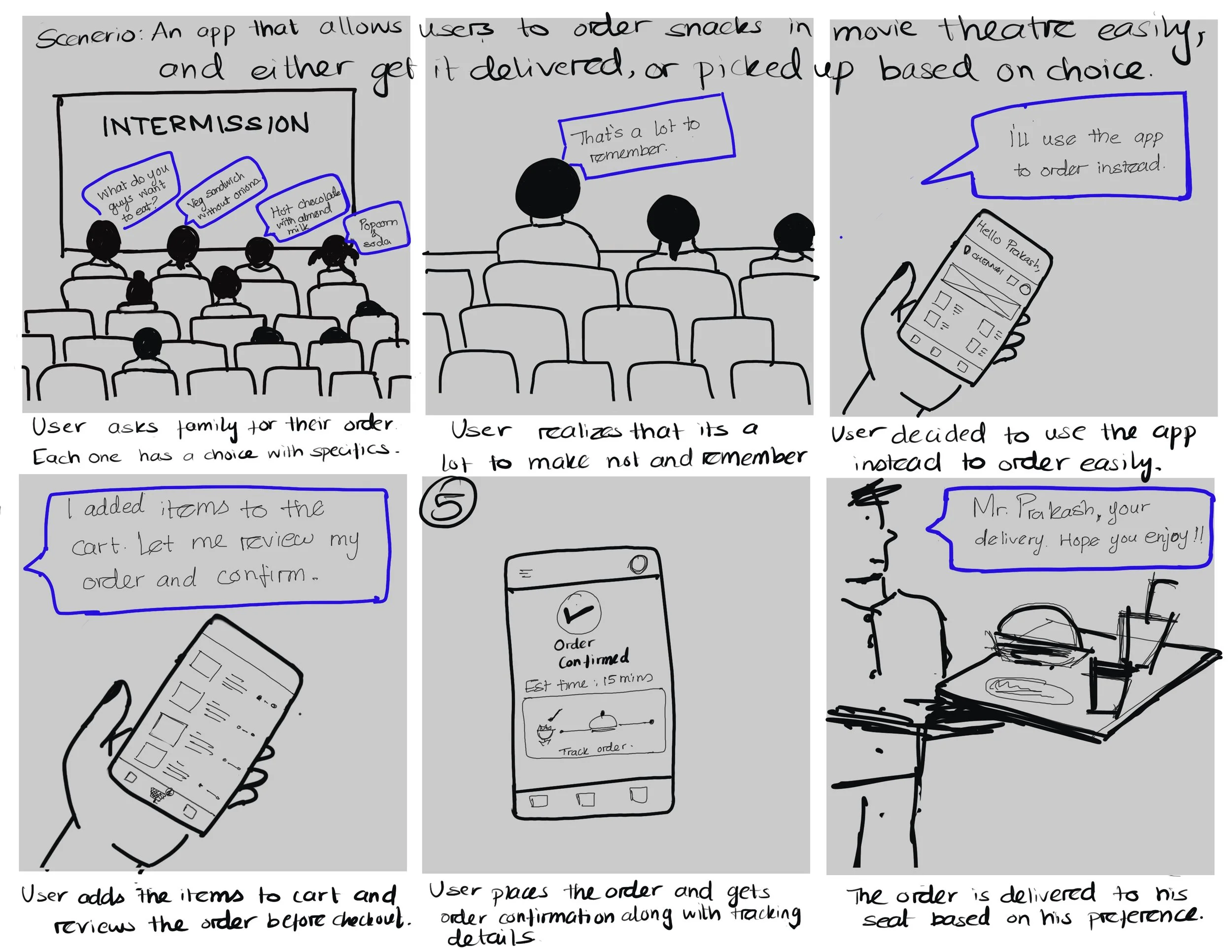
Storyboarding: Close up
STARTING THE DESIGN
User flow
After user research and identifying user pain points, I started my design process by creating a user flow. My goal here was to make strategic decisions that would improve overall App navigation
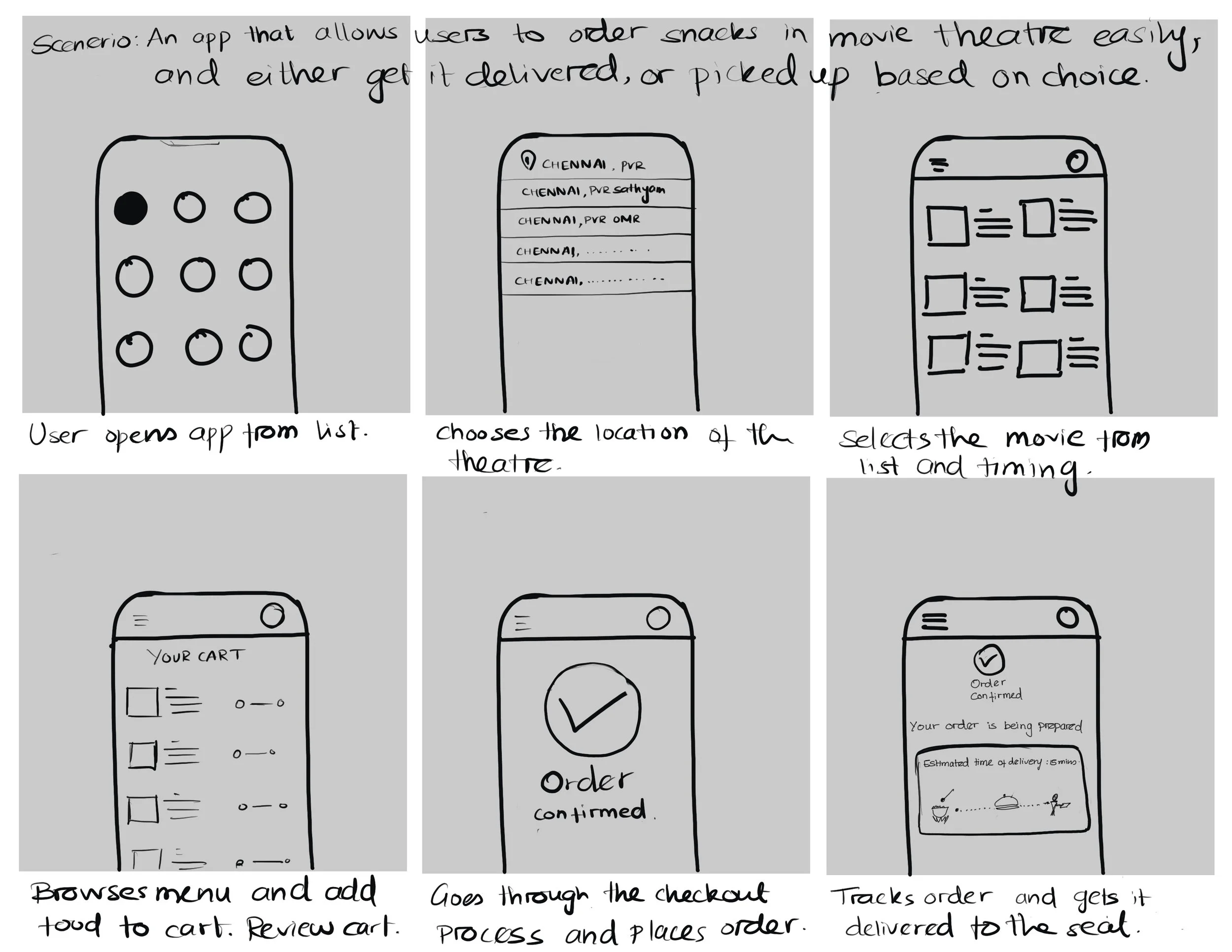
Storyboarding: Big picture
After creating personas, I sketched storyboards for one persona to help visualize and explore the user’s experience using the Snack Break App.

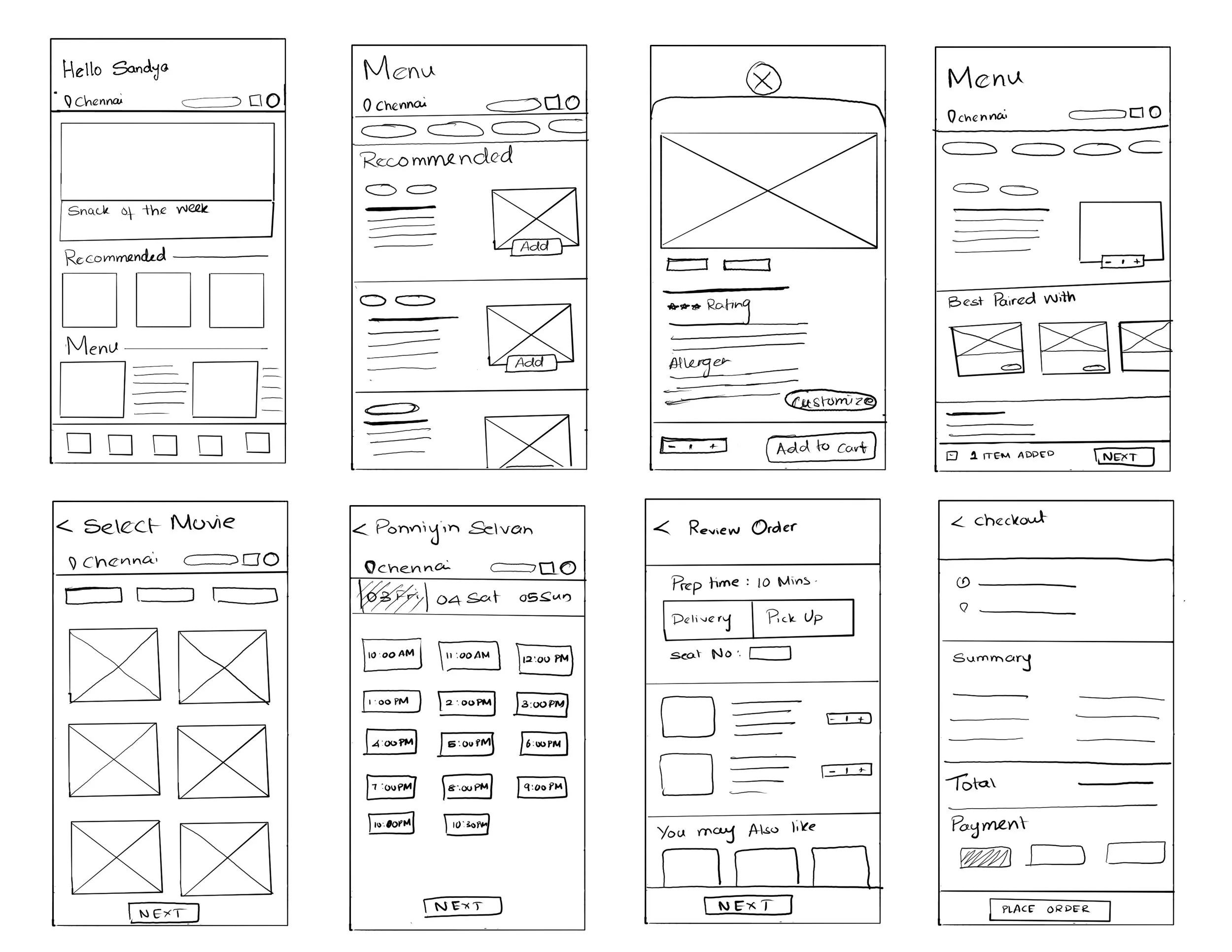
Paper wireframe
Multiple iterations on paper helped refine and sort the elements that made it to digital wireframe to address user pain points. Taking the time to draft iterations of each screen of the app on paper ensured that the elements that made it to digital wireframes would be well-suited to address user pain points. For the home screen, I prioritized a quick and easy ordering process to help users save time.
Digital wireframe
Moving on to the next phase, I transferred paper wireframes to digital and made sure the design reflected and addressed findings from user research.
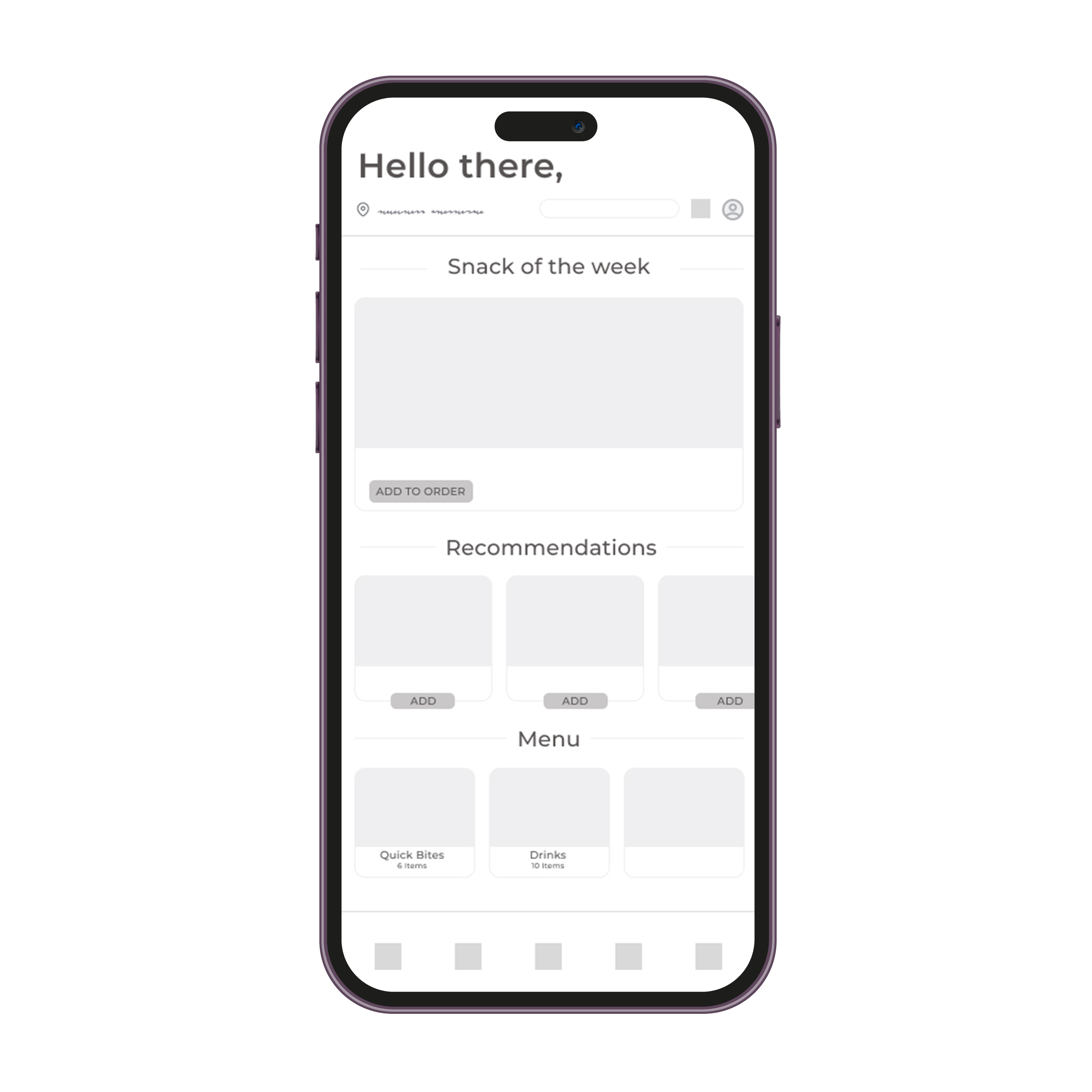


Lo-Fidelity Prototype
Using the digital wireframes, I created low-fidelity prototype that connected the primary user flow of browsing the
menu and ordering a food item so that they could be used in a usability study with users.
Usability Testing
I conducted two rounds of usability studies. Findings from the first study helped guide the designs from wireframes to mockups.
The second study used high-fidelity prototype and helped refine the mockups further to address user needs.

Study Type
Unmoderated study
Location
Remote
Participants
5 Participants
Duration
20-30 minutes
Affinity Mapping
The observations from usability testing were noted down and grouped together to find a pattern and common themes.
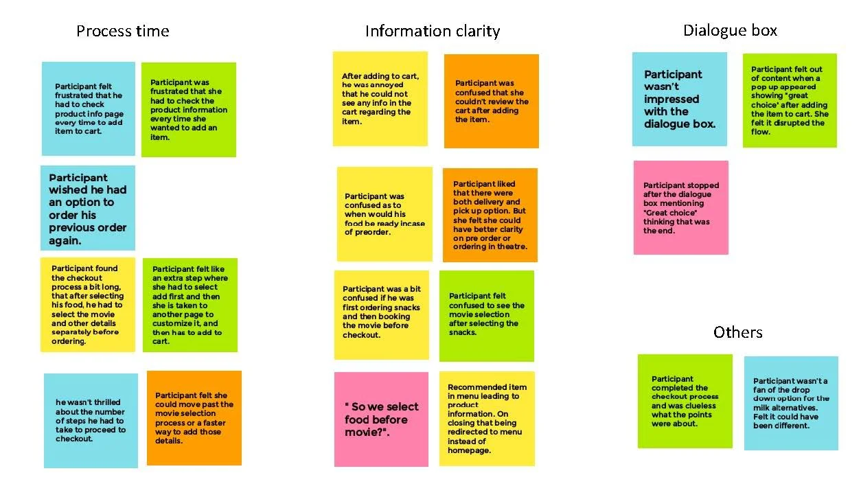
Usability Study: Round 1 Findings
After grouping the observations into common themes, I narrow down the most important pain points to be addressed while refining my mockups.
Users felt the ordering process was long.
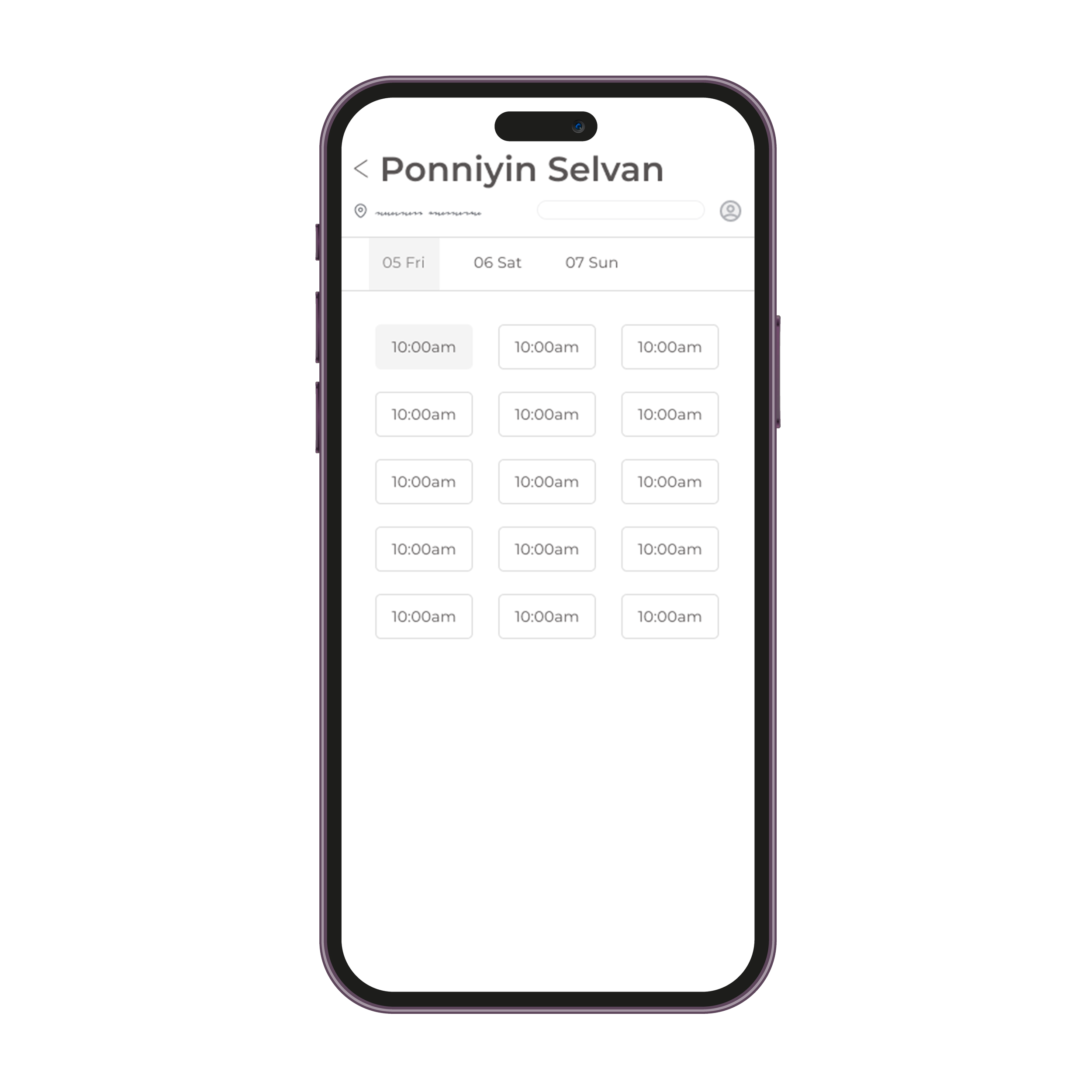
Having to choose movie and schedule after ordering food made users wonder if they were booking
tickets as well.There were not much information given for pickup/delivery in case of preorder. No option to select specific time. Users were unsure when to expect the food to be ready.
REFINING THE DESIGN
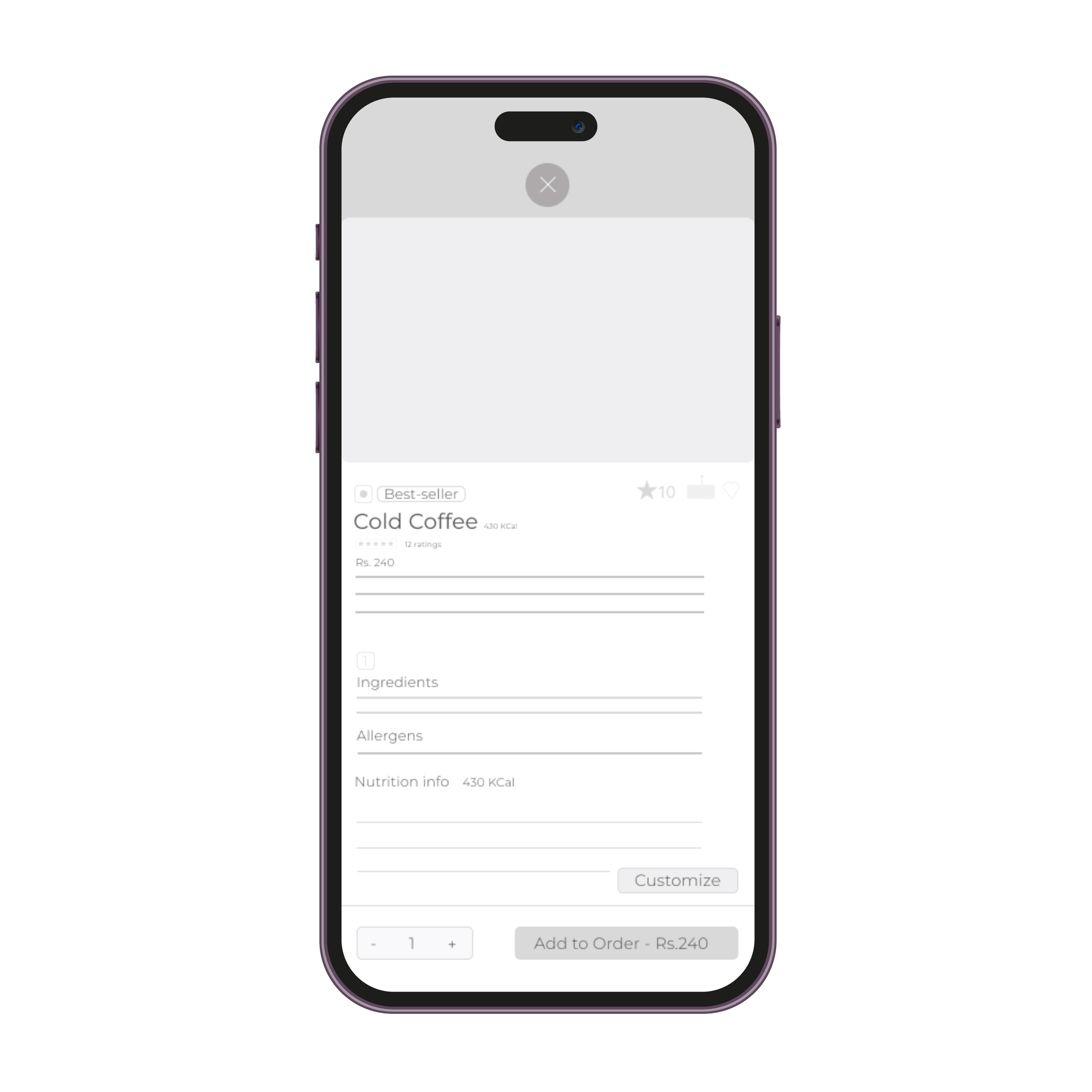
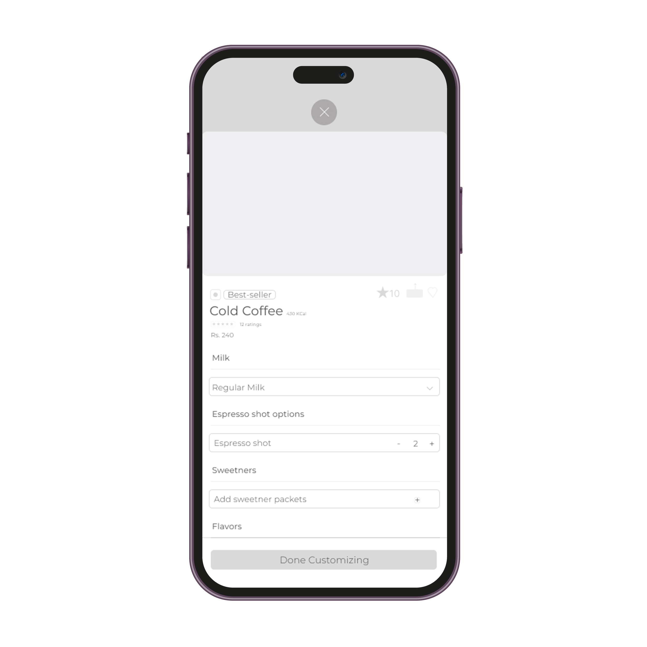
Mockups
During the usability study users revealed frustration on length of process and expressed confusion on ticket selection option after food selection. I modified the ticket page where the details are loaded based on their booking and the length of the process is consolidated as well.

Before Usability Study
After Usability Study

Before Usability Study
Information Clarity
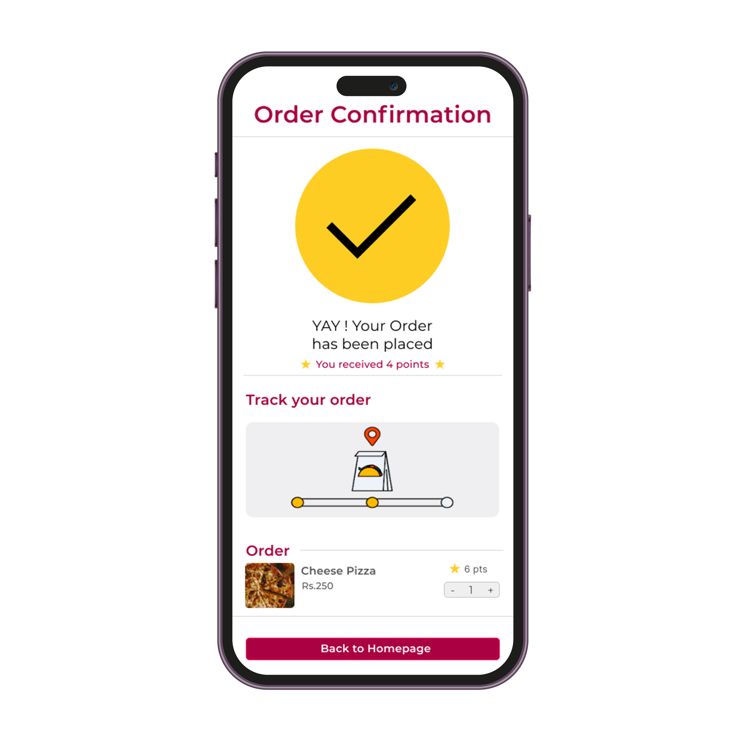
Early designs had options for preorder pickup and delivery, but after usability study, I added specific timing options for users to select from for receiving their food. The order confirmation page allows them to track the order on the movie date when the preparation begins.

Before Usability Study
After Usability Study

Usability Study: Round 2 Findings
After completing hi fidelity mockups based on insights from Round 1 Usability study, I conducted another round of usability study for the high - fidelity prototype as well. The findings from the study were:
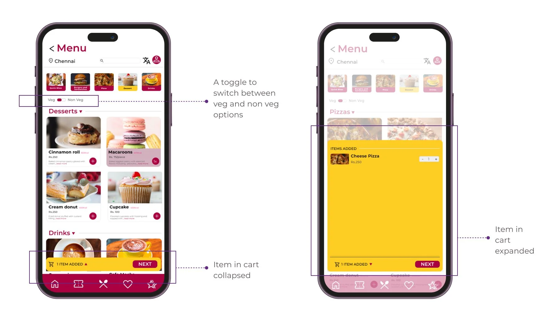
Add to cart information is not that significant.
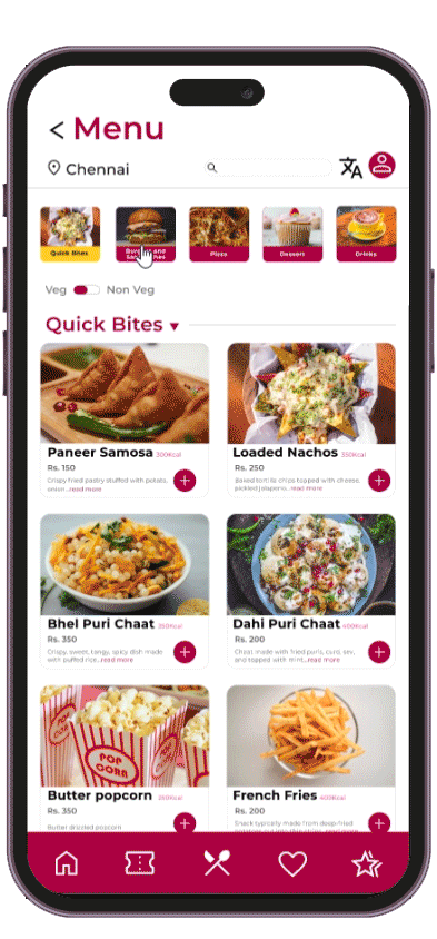
Users did not find a point having a separate filter for veg and non veg.
After Usability Study
Hi Fidelity UI Design
After conducting usability study and modifying designs to suit user needs better, I started working on the visual elements of the wireframes. The design includes features for both exploration and Growth.
Color Palette
Snack Break’s palette showcases bright, appetizing and visually appealing colors. The palette reflects PVR Cinema’s aesthetics as well, such that the app is relatable by the users.

Hi Fidelity Mockups
Primary User Flow: Order during movie
Typography
Snack Break's type scale provides the typographic variety necessary for the app content. All items in the type scale use Rubik as the typeface, and make use of the variety of weights available by using Montserrat Regular, Medium, and Bold.

Iconography
Snack Break's icons were picked from Google Material library such that they reflect the brand's aesthetics.

Buttons

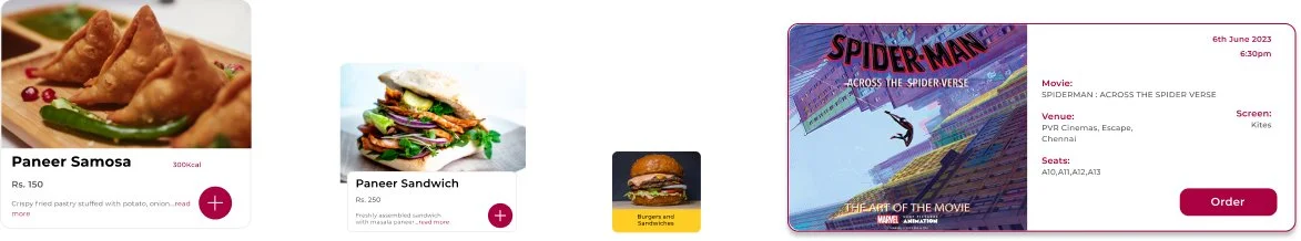
Cards

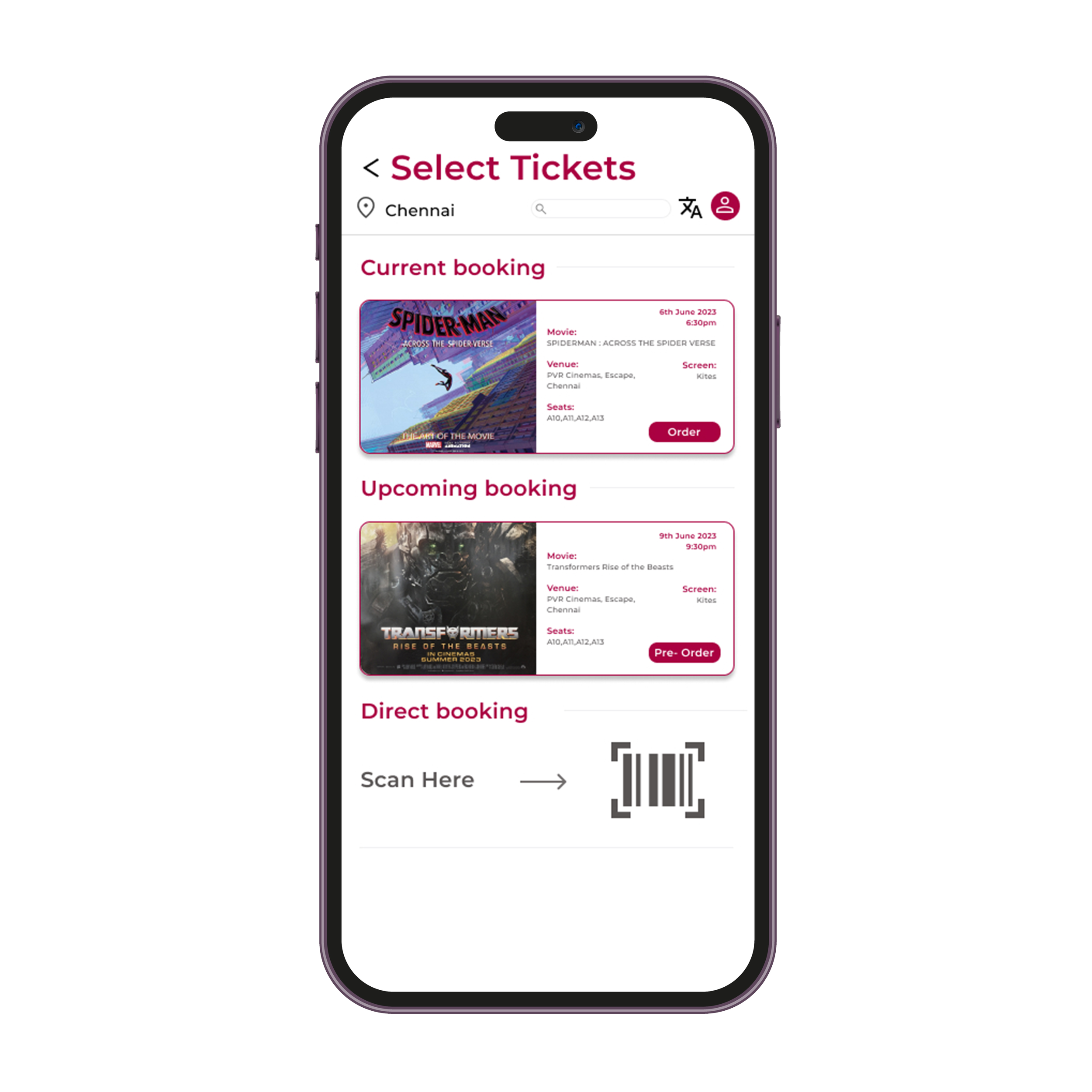
Mockups for Preorder pickup/delivery
Food preorder has both pick and delivery options. Both allow specific timing selection to provide better clarity on when the food is prepared and is ready.

Accessibility Features
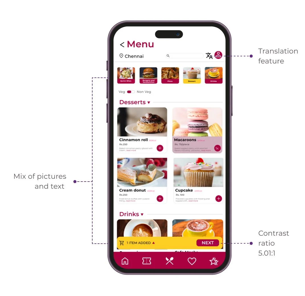
Translation option for users with language barriers
The app’s contrast ratio passed the WCAG 2.1 Level AA Accessibility
Added images along with texts for users to better understand the design
The Solution
Create a user-friendly app called Snack Break for PVR Cinemas customers, making food ordering quick and effortless.
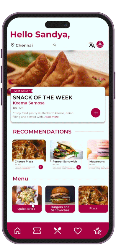
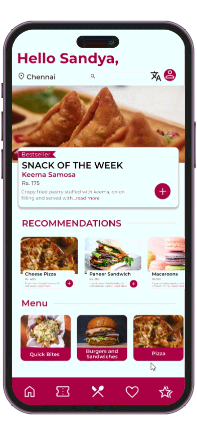
Browsing
Quick access to the entire menu from the seat which allows users to customize order as well.
Customization
Users can customize their food based on their dietary restrictions, allergens or preferences.
They don't need to worry about forgetting their order details when they reach the counter.
Time
Snack Break provides faster menu browsing with options order food from theatre of preorder before movie.
The users are also given option to either pickup order or get it delivered to seat based on preference.
Tracking
Snack Break sends out tracking information to users on placing order. They get to check the process as well, thereby assuring that food is prepared fresh.
Incase of preorder, the tracking information is notified 15 mins before order preparation.
Accessibility Features
Translation option for users with language barriers
The app’s contrast ratio passed the WCAG 2.1 Level AA Accessibility
Added images along with texts for users to better understand the design
Try out the Snack Break
prototype
MOVING FORWARD
Impact
The app really helps user skip the entire traditional
ordering process in theatres and instead meet all their needs from their seat.
Quote
“I liked the overall experience. It was easy and I liked
how picture forward it was. I would definitely use this
app and enjoy the movie from my seat.”
What I learned
I learned how understanding a user was so important while addressing the design. Each design modification travelled back to user research. This further broadened through usability study when they get to interact with the product. It definitely helped refine the design for the better.