Artsplore Process Book
THE PROCESS
User Research : User Interviews and Survey Summary
I conducted 5 user interviews and created Empathy maps to better understand the target users and their needs. The target users were students and working professionals.
The key findings from the interviews were:
Many target users access E- learning platform to acquire a new skill or advance their career by gaining certifications.
Post Covid, many users have started using these platforms for career transitions or try courses before enrolling in universities to ensure their choice is correct.
Users are overwhelmed by the options available, especially when they have multiple interests and are unable to narrow down their choice.
Users wanted more interactive learning experience and a forum to share resources as well as have discussion with both students and mentors.
Competitive Analysis: Summary
I analyzed Artsplore's competitive websites based on the user needs and pain points from initial research. The competitive analysis projected that the existing E-learning platforms fail to provide a holistic user experience. They succeed in certain aspects and fail in few. This helped narrow down the problems that need to be addressed to provide the users an overall great learning experience.
The key findings were:
There are very few E-learning platforms dedicated for Art and Design related courses.
The platforms do not provide any direction or personalized options based on users interests.
Most of the platforms do not have a forum that showcases student work or share resources.
Most of the courses are hardly evaluated by experts so lacks credibility.

User Pain points
1
Personalization
Lack of direction or personalized course options based on user's interests.
2
Credibility
Online platforms lack courses that are evaluated by experts making it less credible for users.
3
Experience
Lack of forum to display student work and share resources and interactive learning reduces overall user experience.
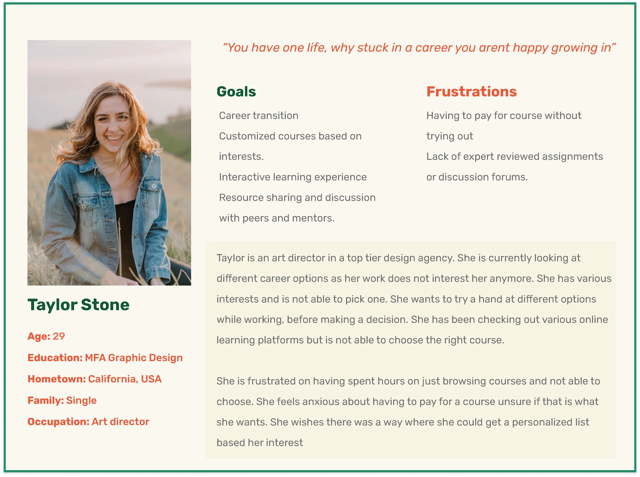
User Personas
Taylor is a Junior art director working in a design agency who needs personalized course options to choose from in an E- learning platform because she wants to try options before deciding on which path to take for career transition.
User Journey
I created a user journey map of Taylor's experience using the site to help identify possible pain points and improvement opportunities.
DESIGN
With the information gathered from User research and narrowing down the user pain points, I proceeded to the next phase to start designing the experience. This included creating Paper and Digital wireframes, Low- fidelity and High - fidelity prototypes and conducting Usability testing.
Site Map
Website Navigation marks as the key ingredient to User experience. My goal here was to make strategic Information Architecture decisions that would improve overall website navigation. The structure I chose was designed to make things simple and easy.

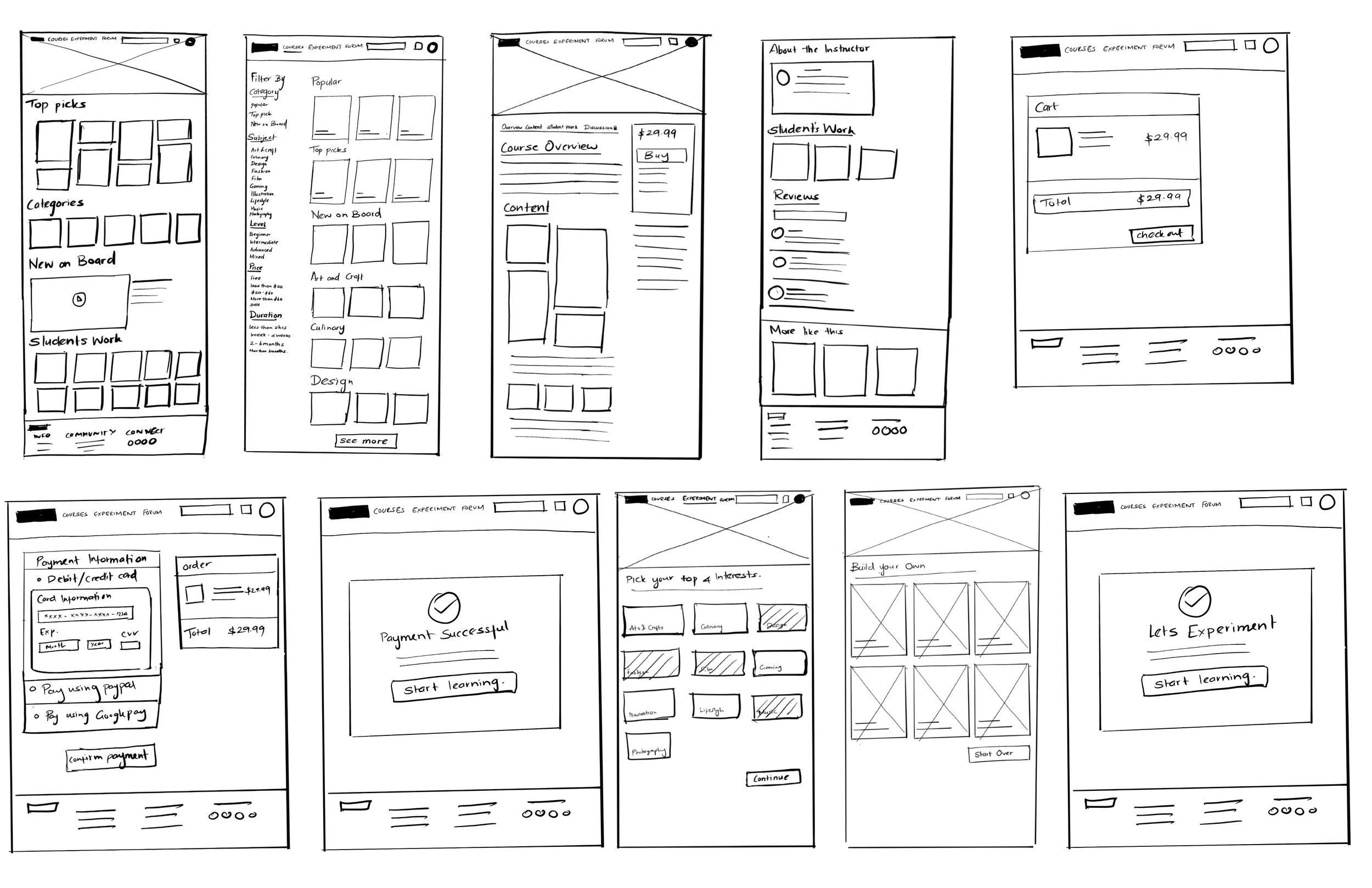
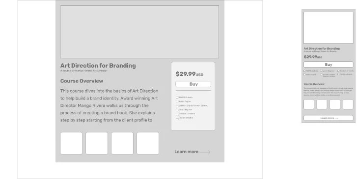
Paper Wireframes
Next, I sketched out wireframes based on the user pain points about personalization, credibility and experience. Because users access the website using variety of devices, I started sketching for additional screen sizes to make sure site is fully responsive.
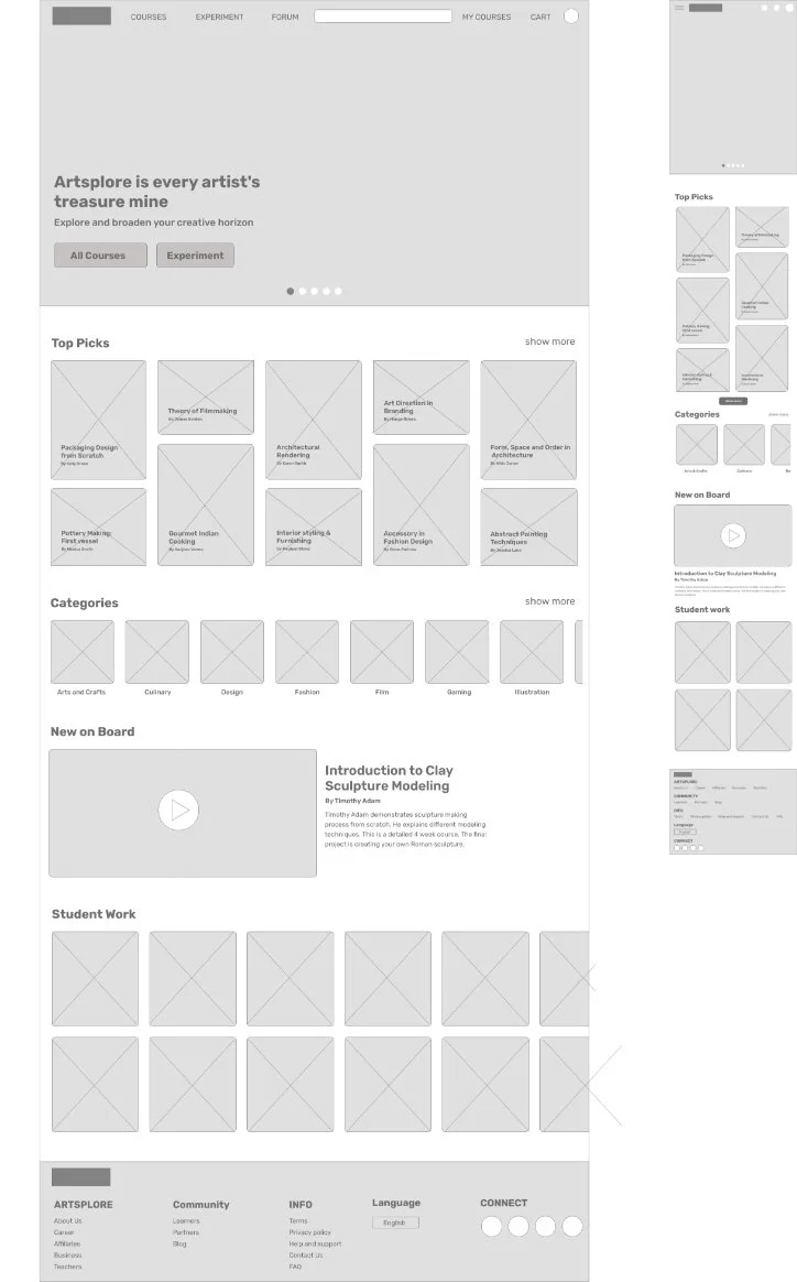
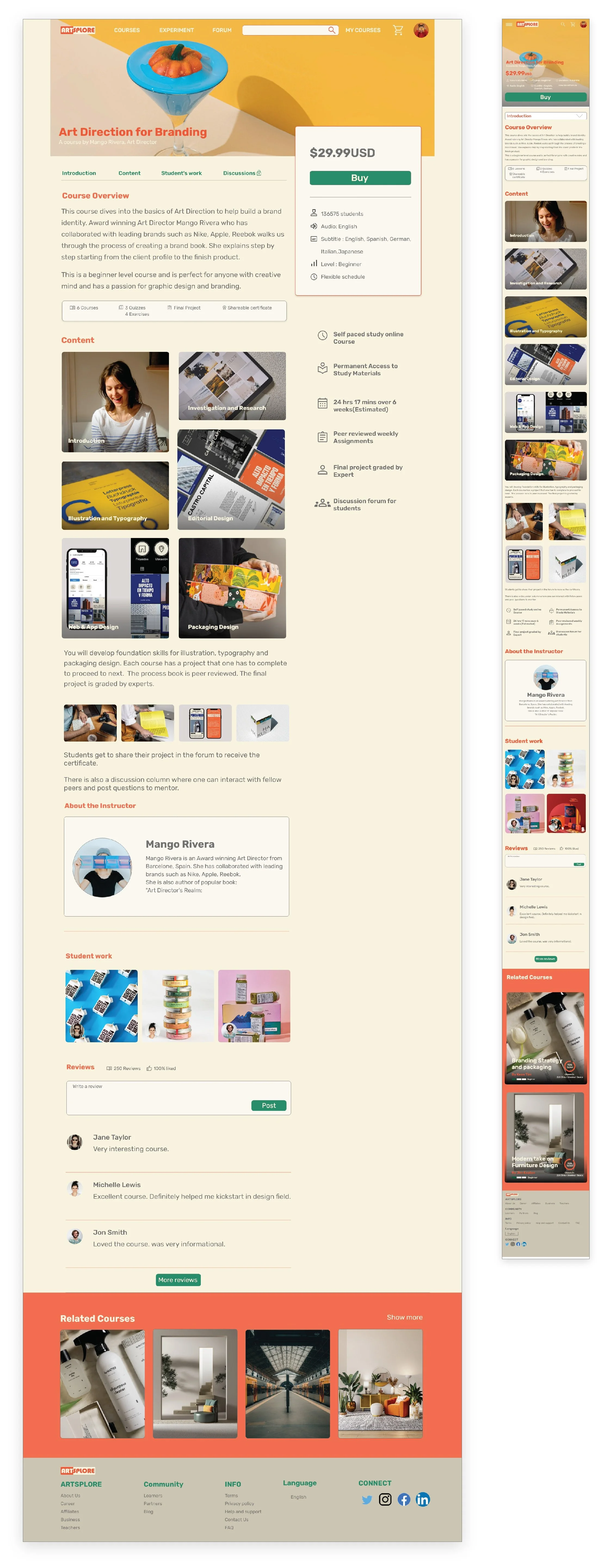
Digital Wireframes
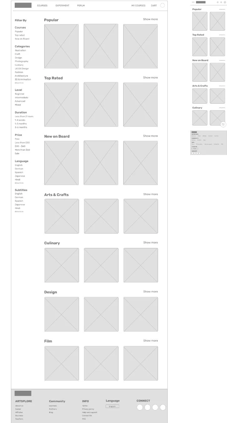
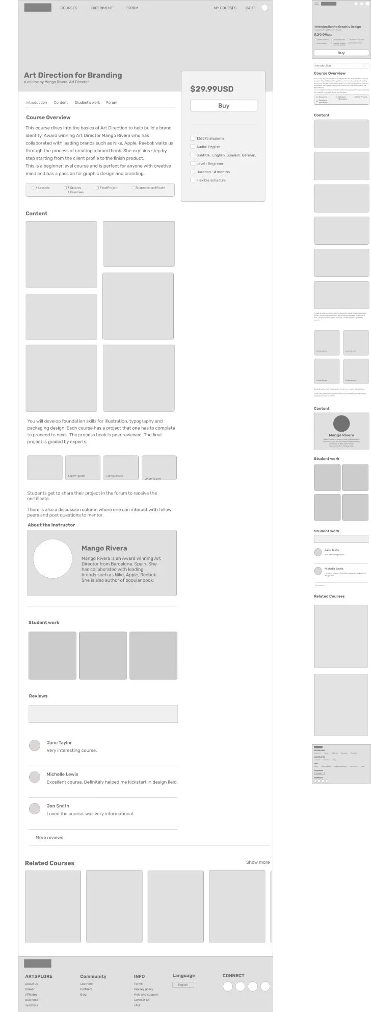
Moving from paper to digital wireframes made it easy to address user pain points and improve user experience. Prioritizing easy navigation, useful button locations and visual element placement on homepage was a key part of my strategy.
Usability Testing
I conducted an Unmoderated usability testing for Artsplore's low-fidelity prototype with 5 participants.
Usability Study Findings
1
Homepage
Homepage had a lot of content and users felt it densely spaced and heavy.
2
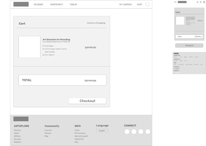
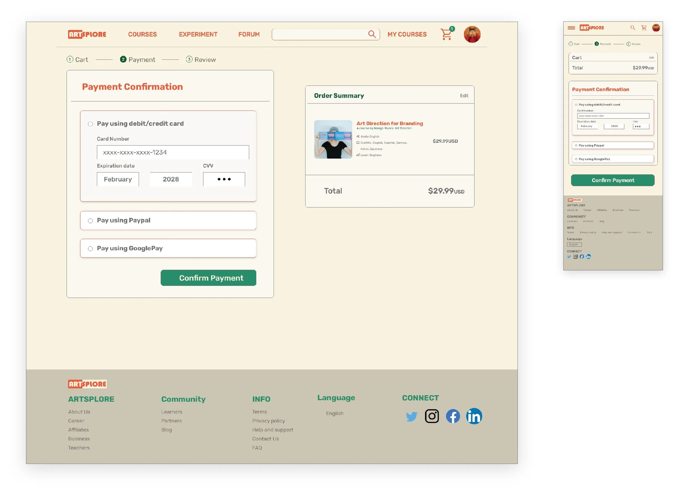
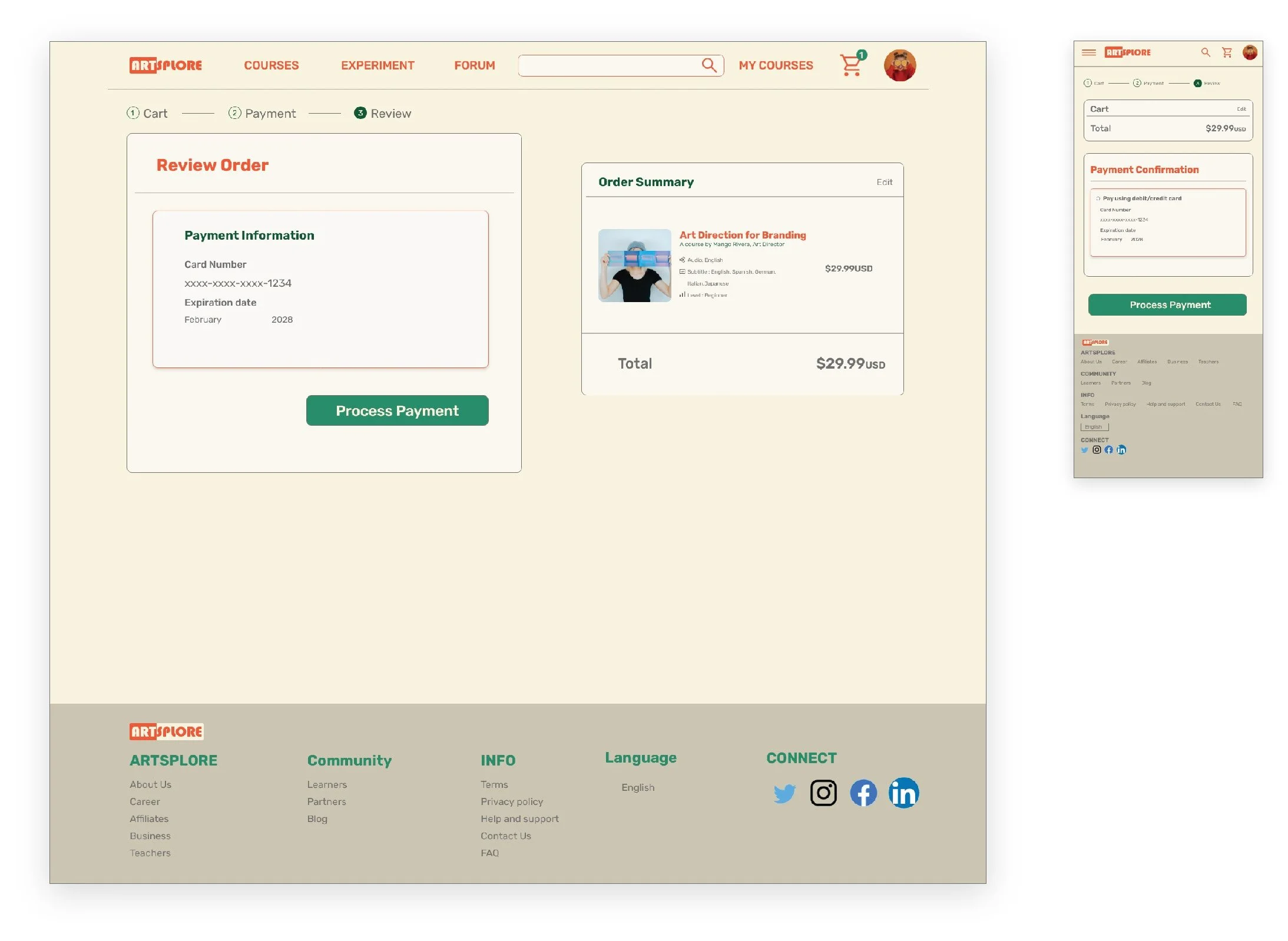
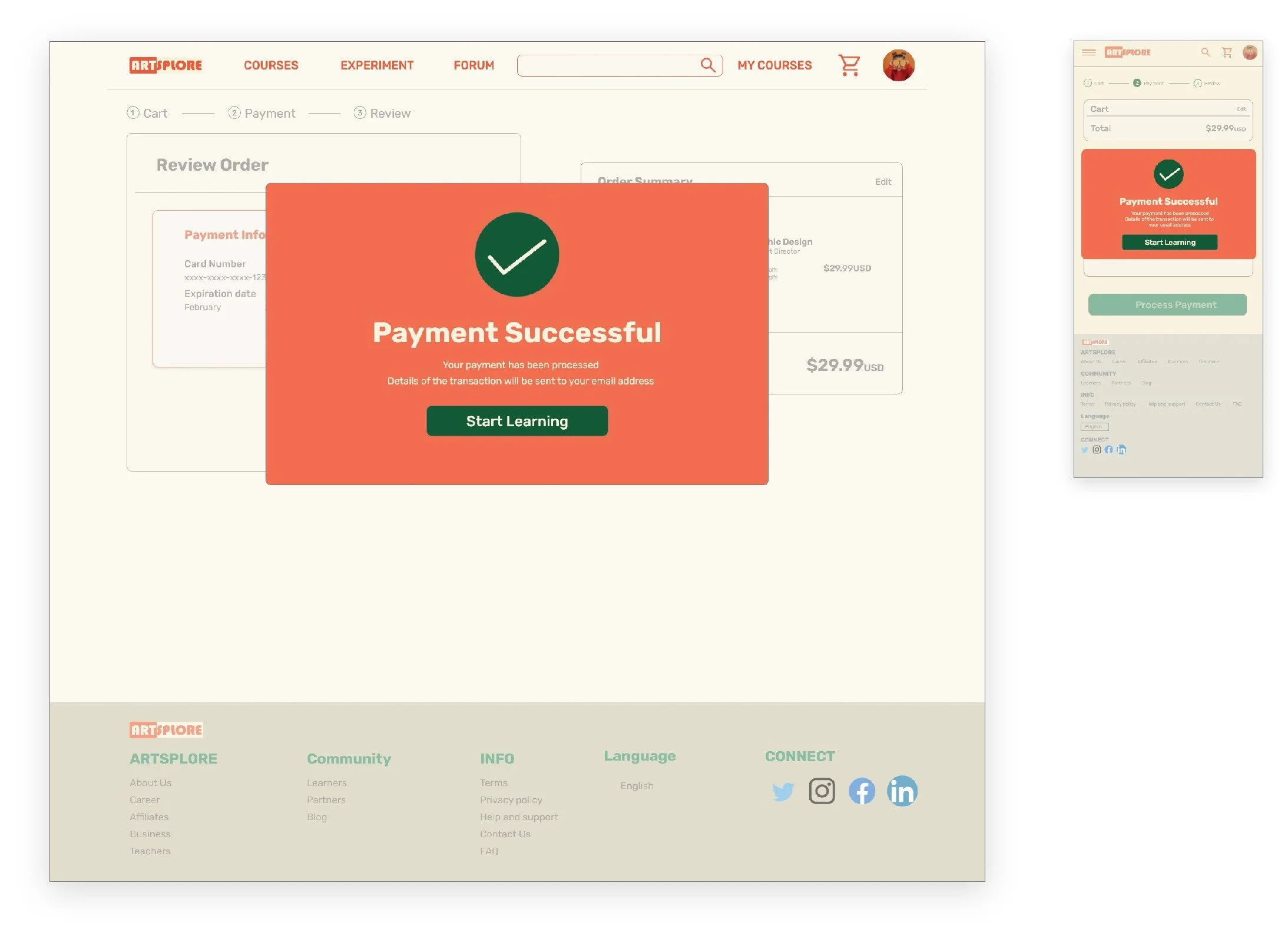
Checkout
Users had to scroll down every time to make a selection in checkout page
Refining The Design
Homepage
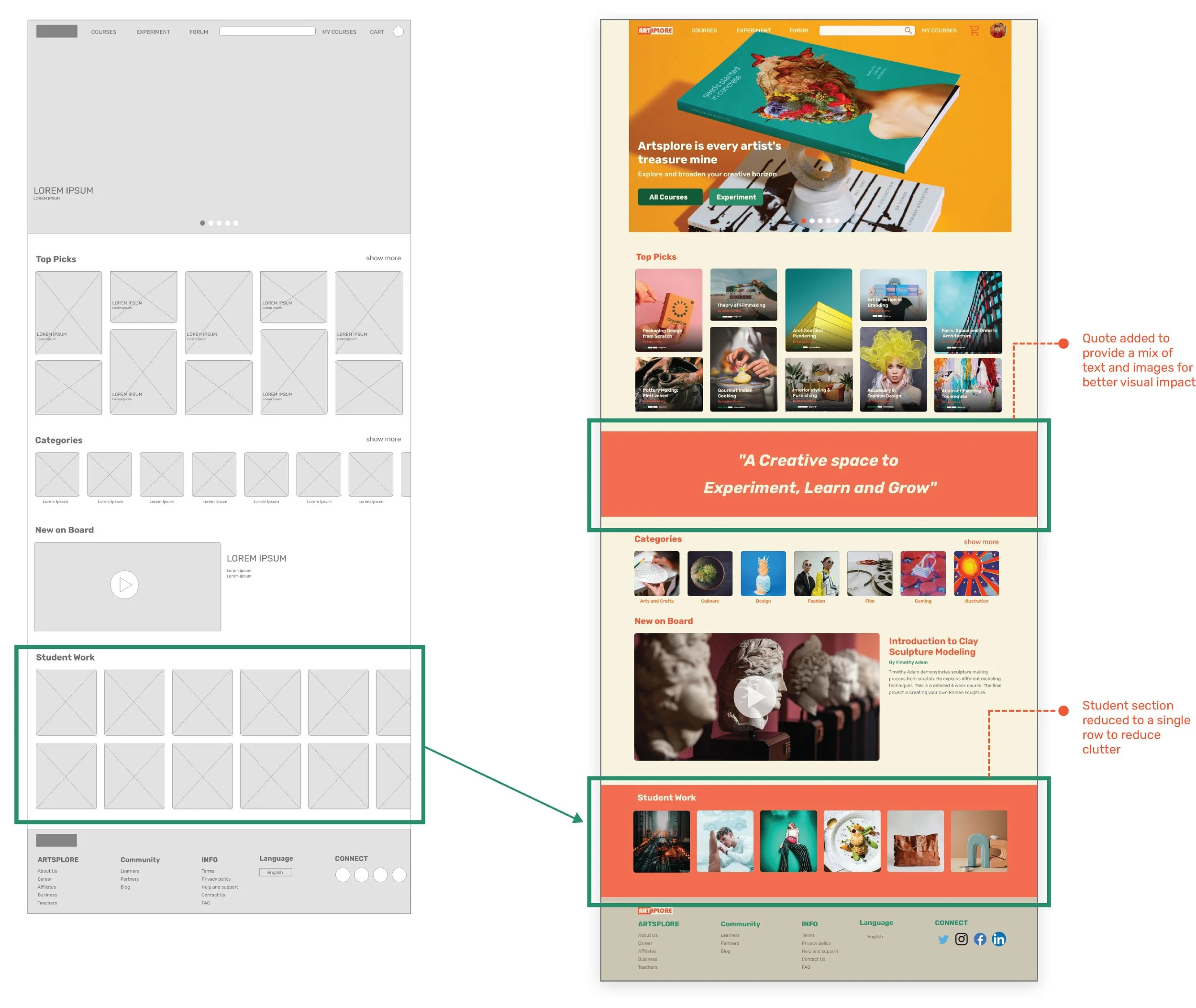
Based on insights from the usability study, I made changes to Homepage layout. One of the changes I made was removing an entire row of student’s work and increasing spacing between each section. I also inserted a quote which reflects Artsplore’s motive to grab user’s attention.
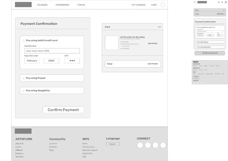
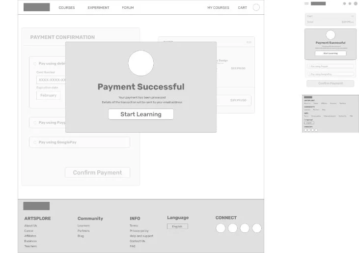
Checkout
I reduced spacing in between each section to make sure the checkout button was on the first page instead of having to scroll and added checkout process indicator on top for better clarity.

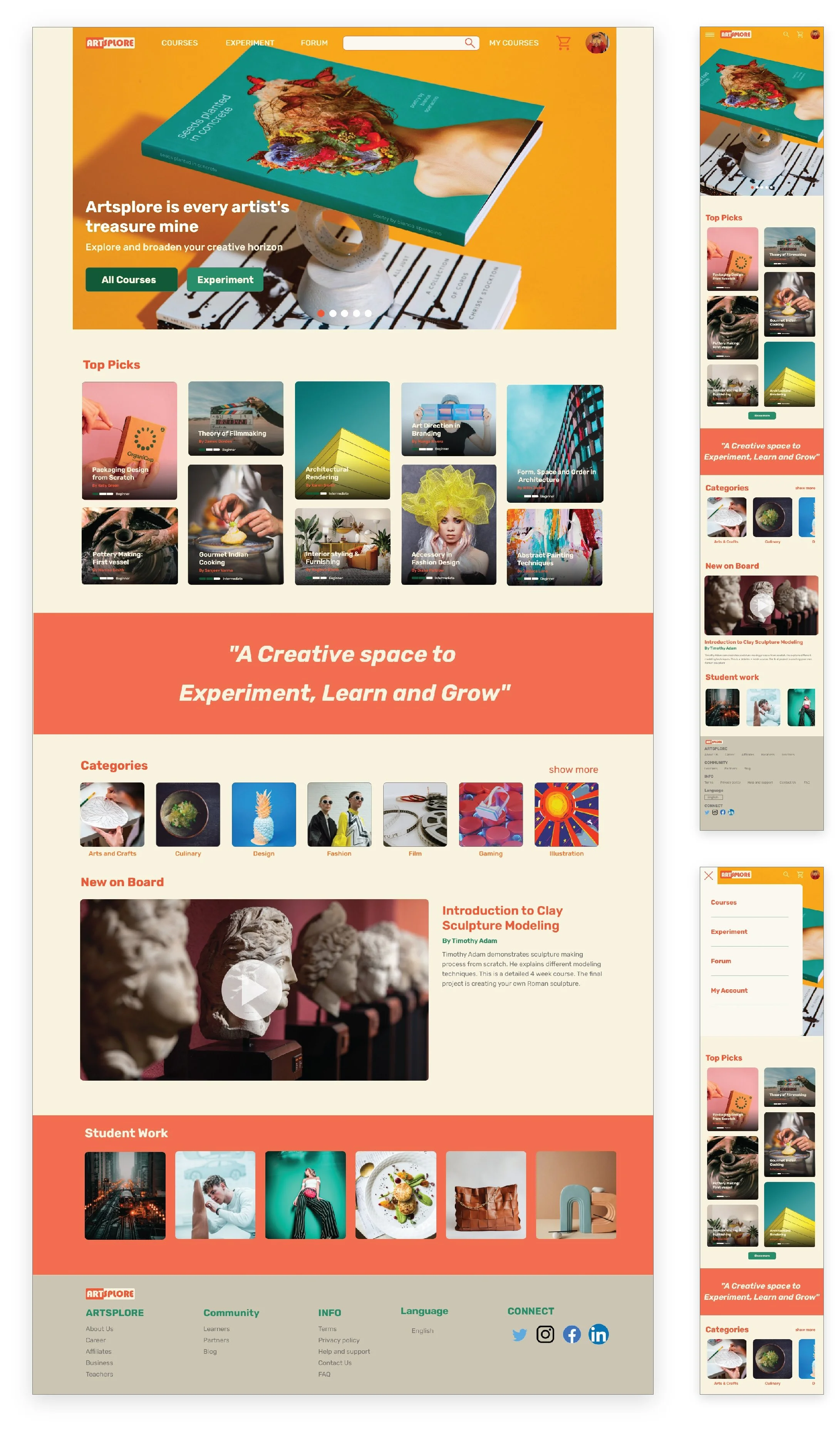
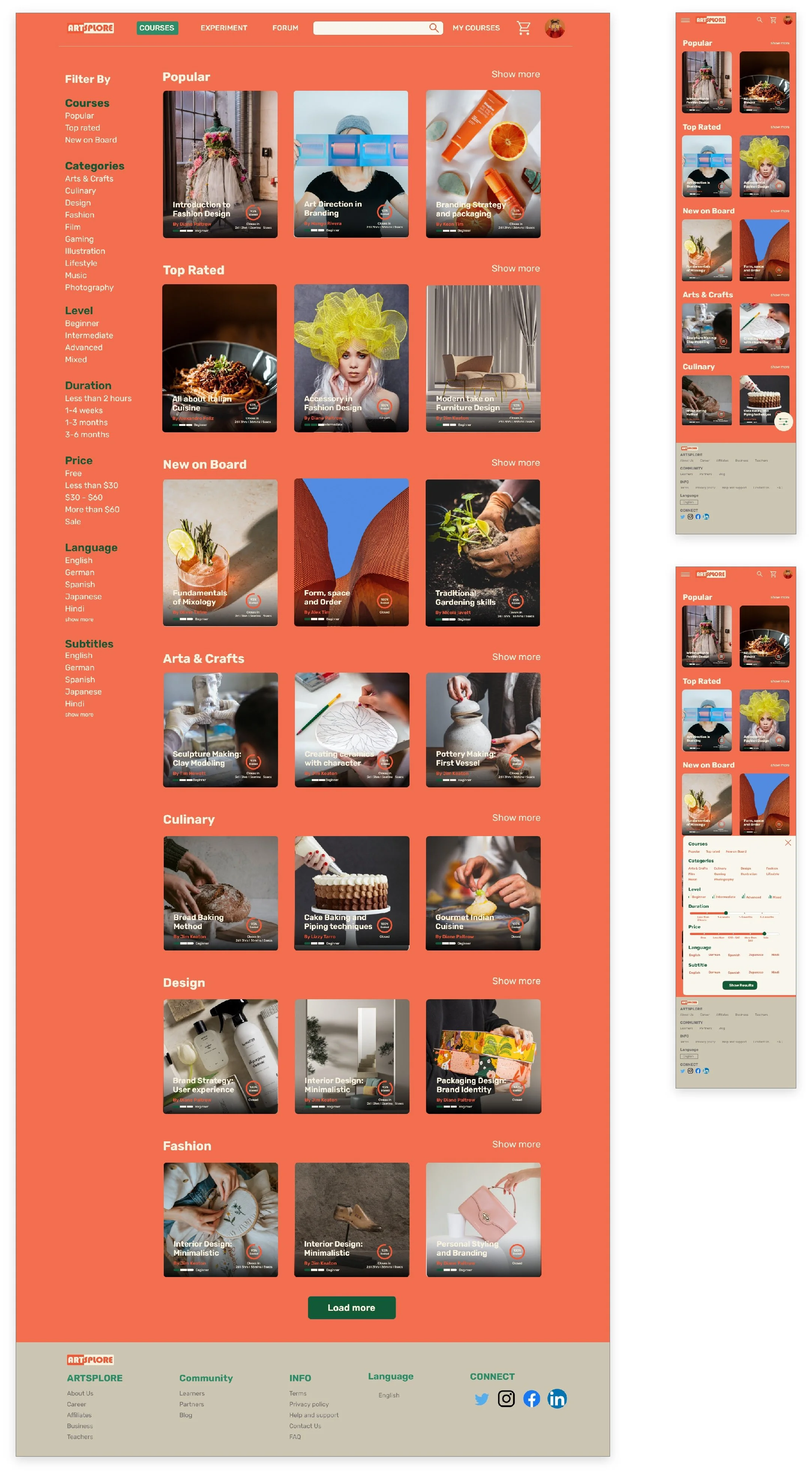
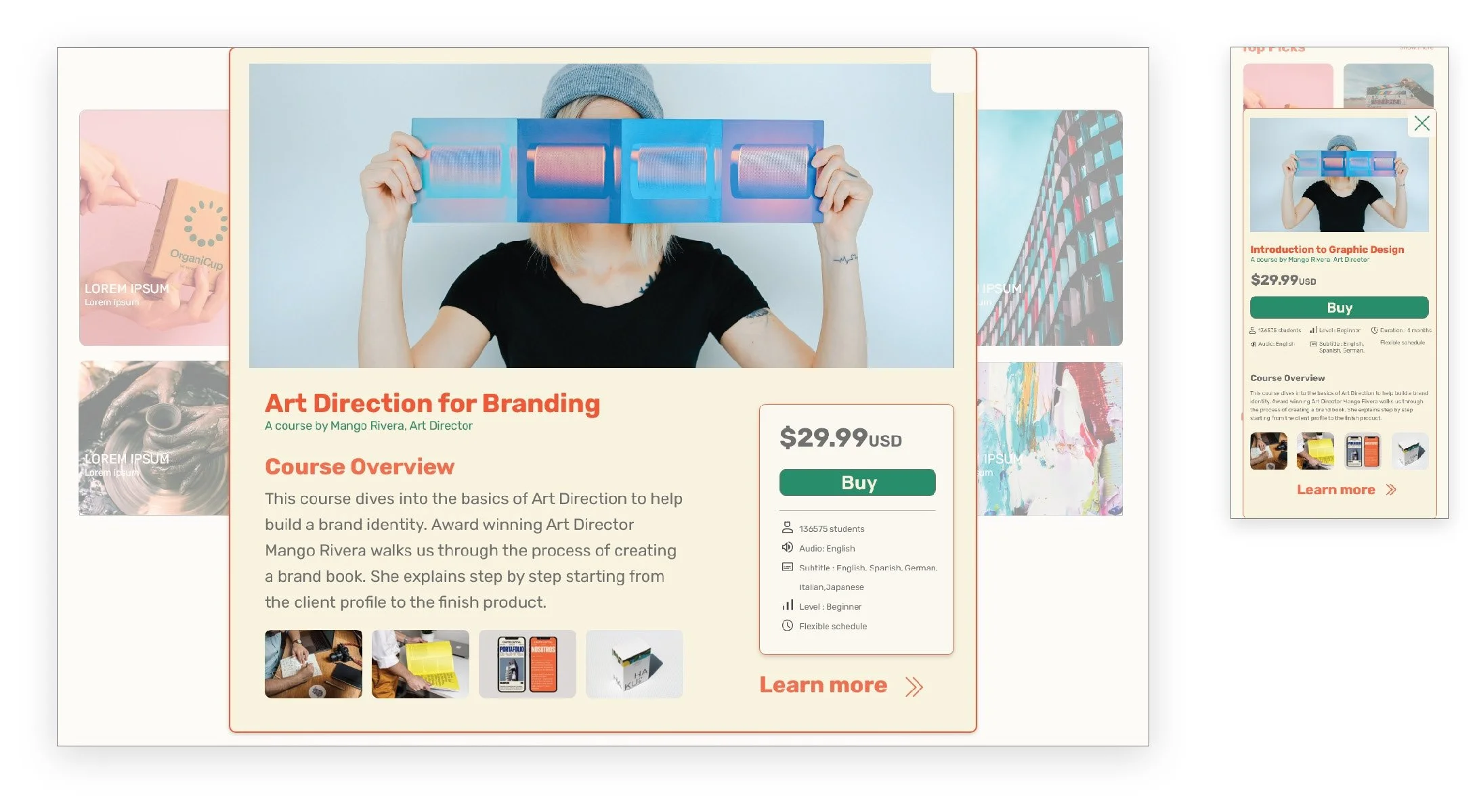
High Fidelity Mockups
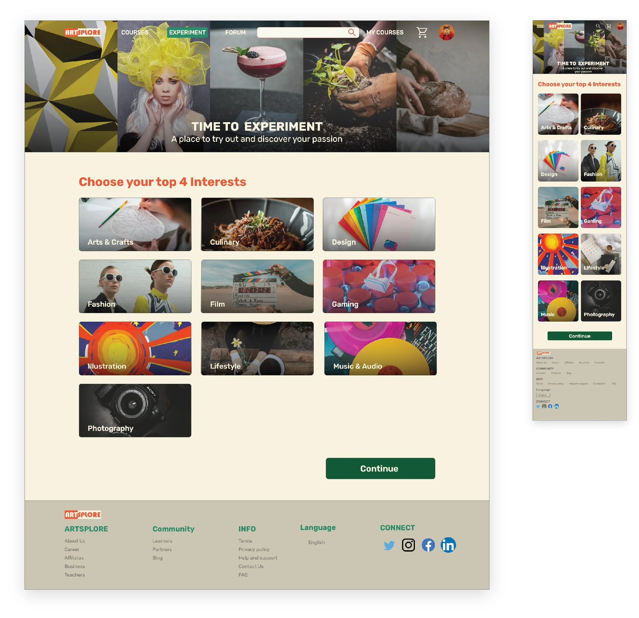
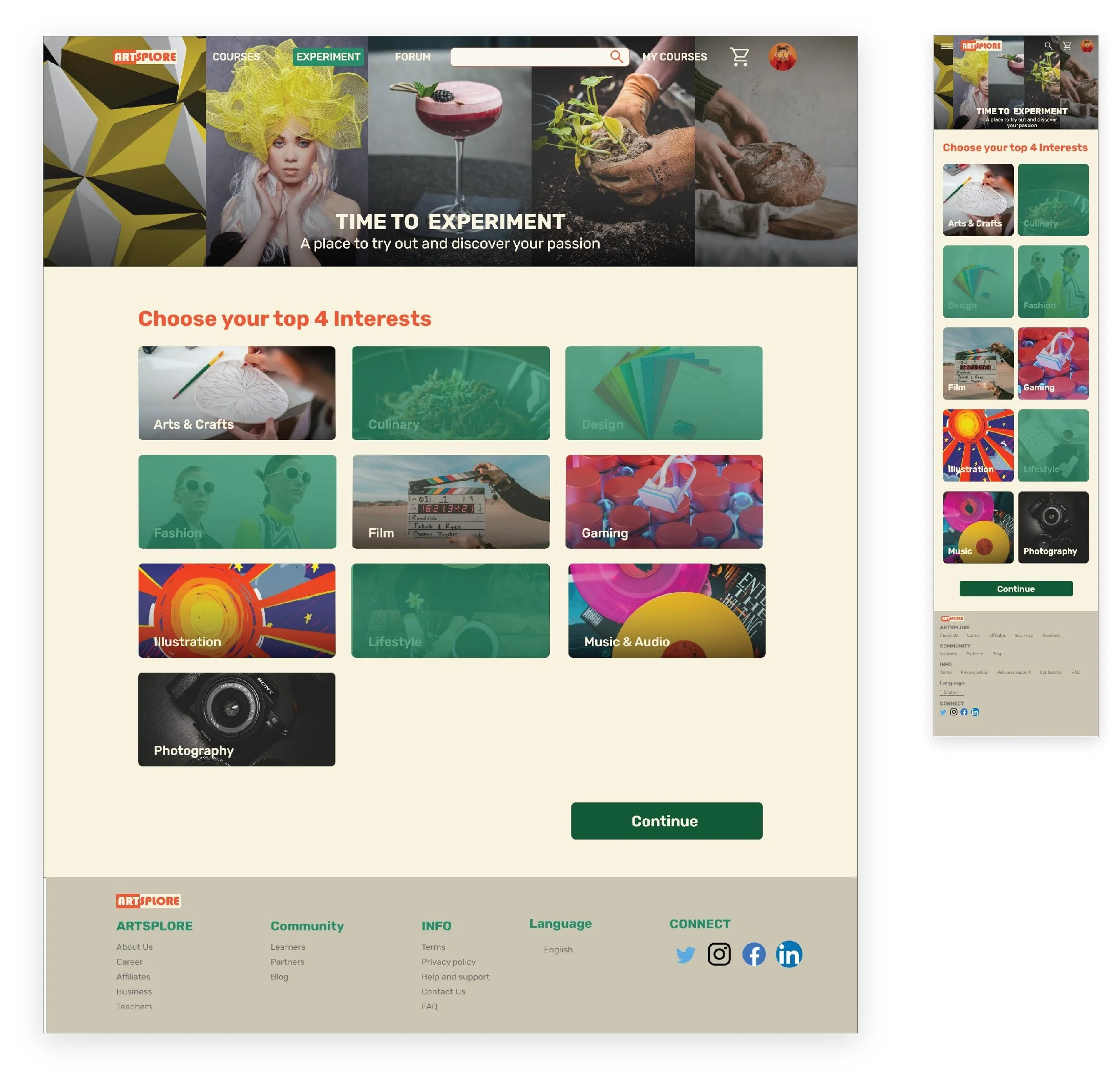
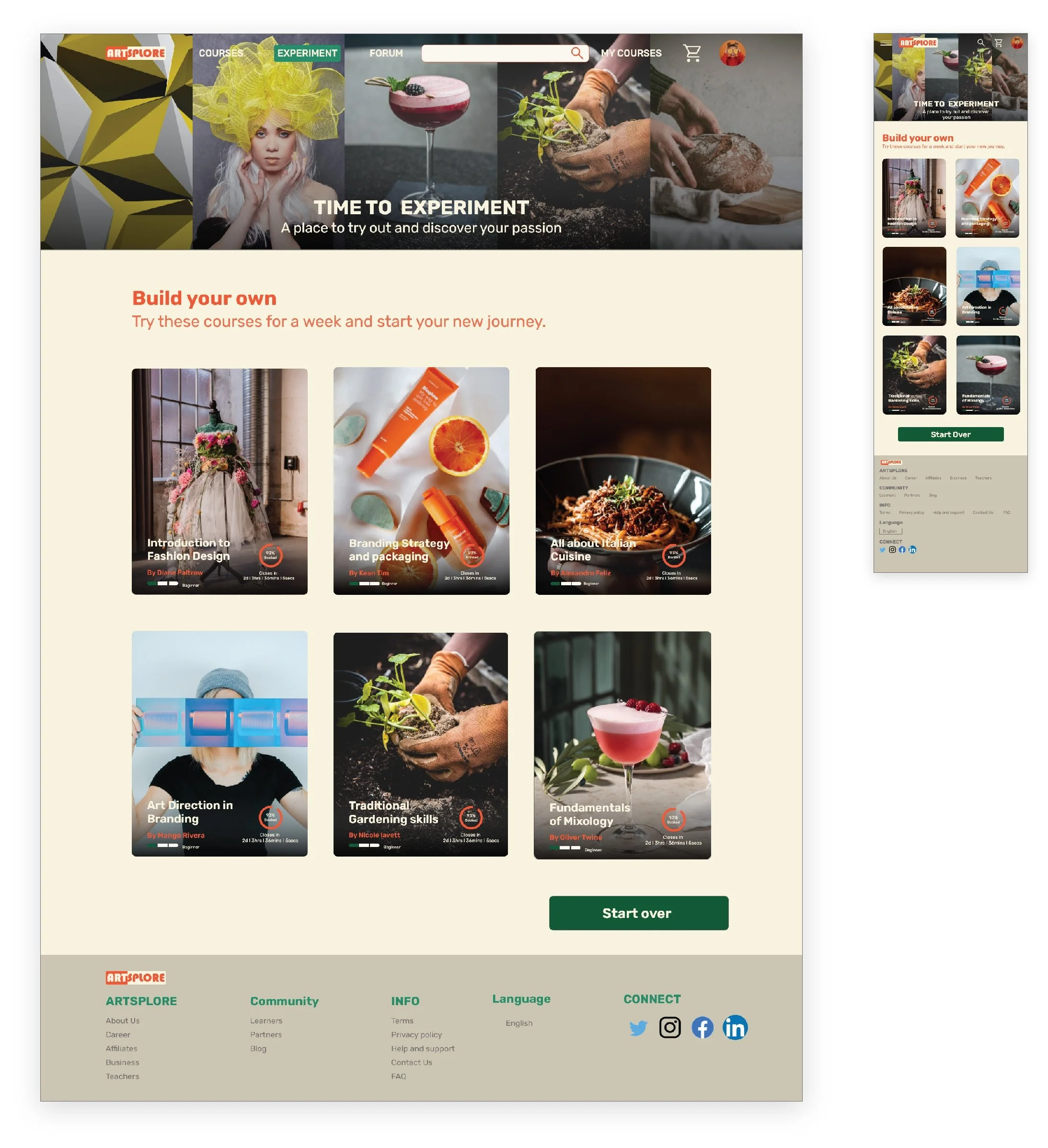
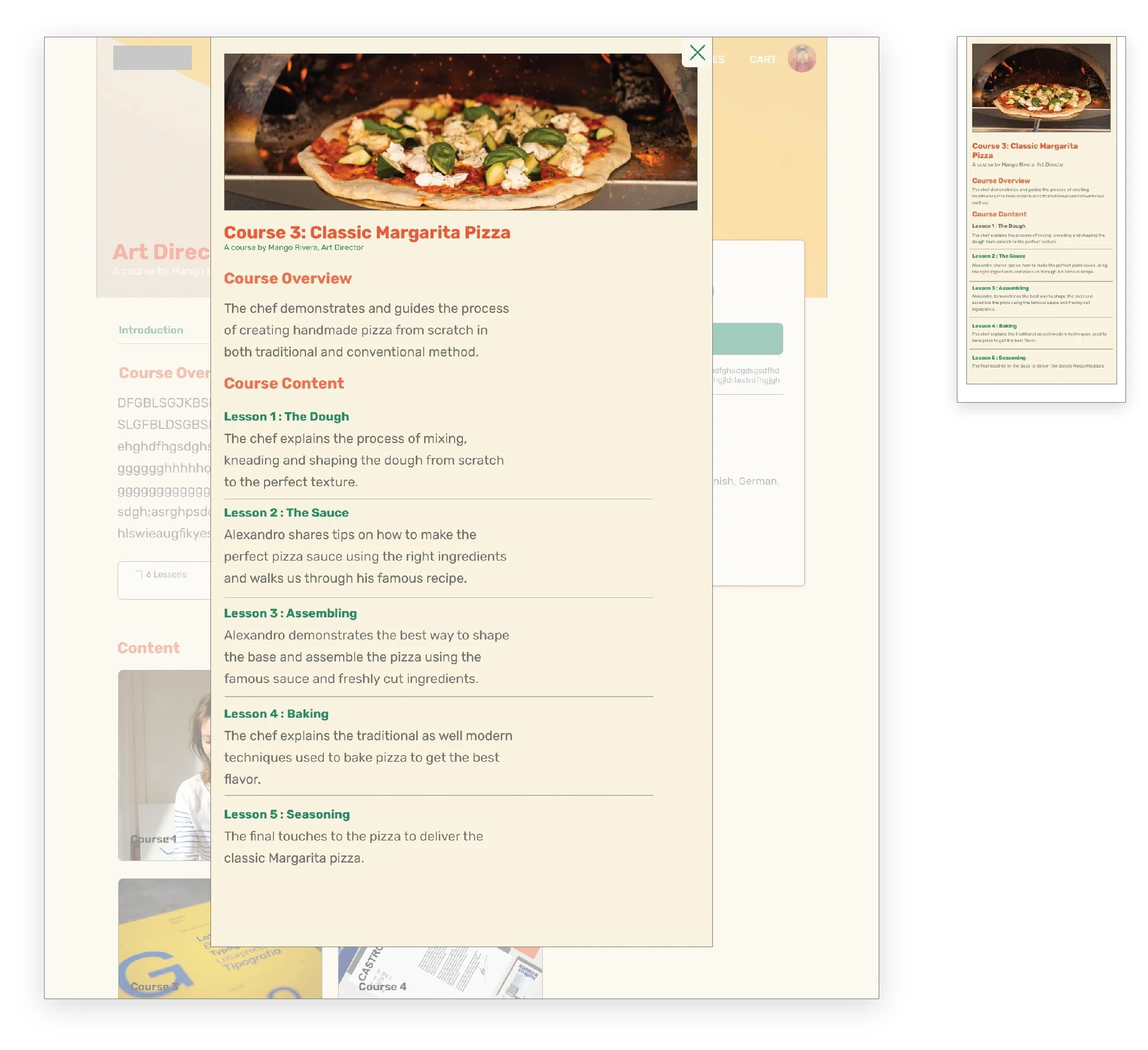
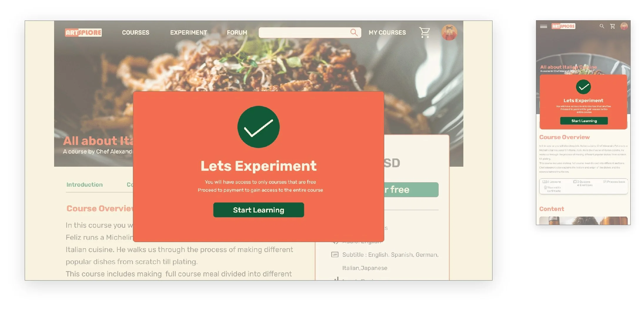
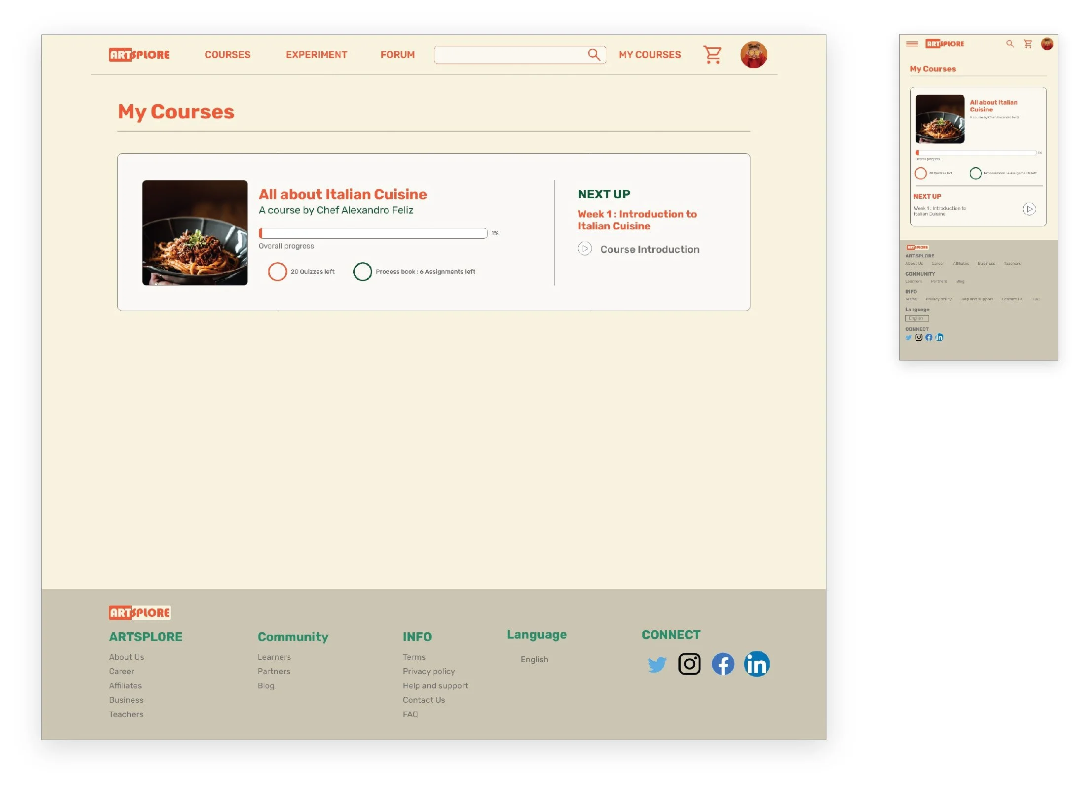
After conducting usability study and modifying designs to suit user needs better, I started working on the visual elements of the wireframes. The design includes features for both exploration and Growth.
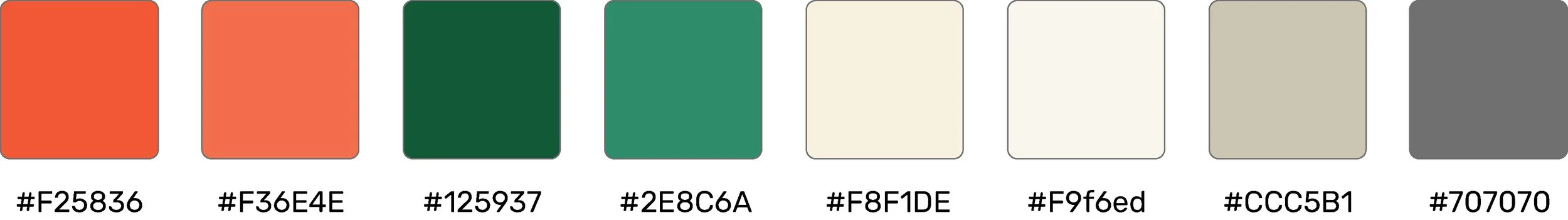
Color Palette
Artsplore's color palette reflects the energy and excitement of starting something fresh and learning new skills, using bright aesthetics that expresses exploration and creativity.
Typography
Artsplore's type scale provides the typographic variety necessary for the app content. All items in the type scale use Rubik as the typeface, and make use of the variety of weights available by using Rubik Regular, Medium, and Bold.

Iconography
Artsplore's icons were picked from Google Material library such that they reflect the brand's aesthetics.
Components
Buttons

Screen size variations


Cards

Screen size variations
Lists
Screen size variations

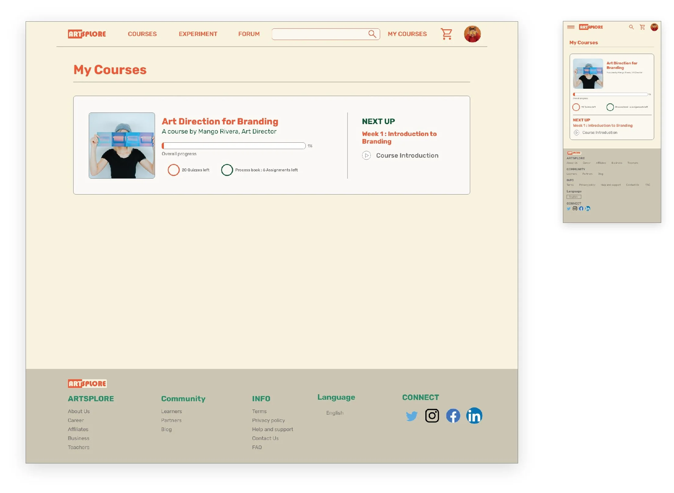
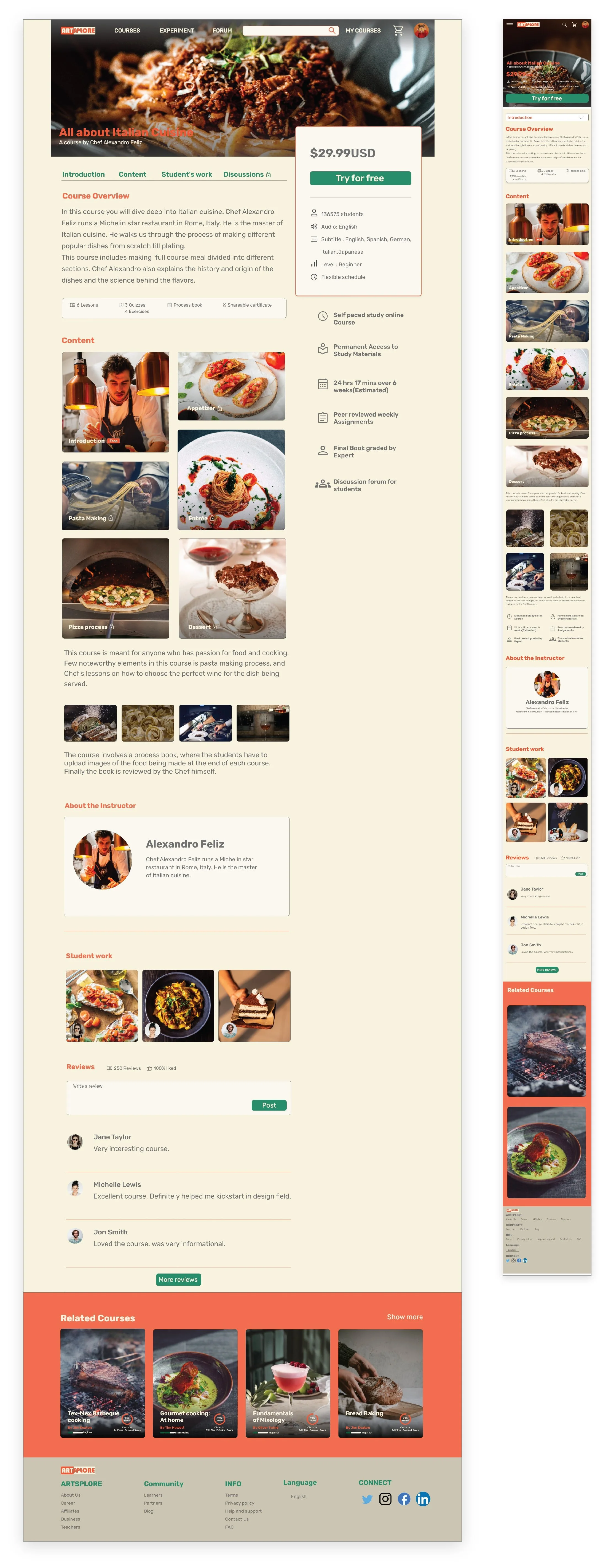
Mockups

MOVING FORWARD
Impact
Our target users found the Experiment feature useful and interesting, also the website was more engaging with images and demonstrated a clear visual hierarchy.
Next Steps
Conduct follow-up usability testing on the new website.
Identify any additional areas of need and ideate on new features.